Saught&Found
Singapore | Helping Brands to Seek and Find
Saught&Found
Brand Consultancy
The Challenge
Client Background
SaughtAndFound is an independent strategy and design studio. They craft meaningful design stories for brand-centric products and businesses. They work on brand strategies, visual identities, design systems, brand executions and more.
Seeking Purpose
Many brands struggle to articulate their core reason for being beyond just profit. The challenge was to define a methodology that digs deep to uncover this purpose, moving beyond surface-level aesthetics to true strategic alignment.
Etymological Depth
The name "Saught" (peace/reconciliation) and "Found" (attainment) needed to be visually represented without becoming too literal or academic. We needed to translate these linguistic roots into a graphic languag
Silent Strength
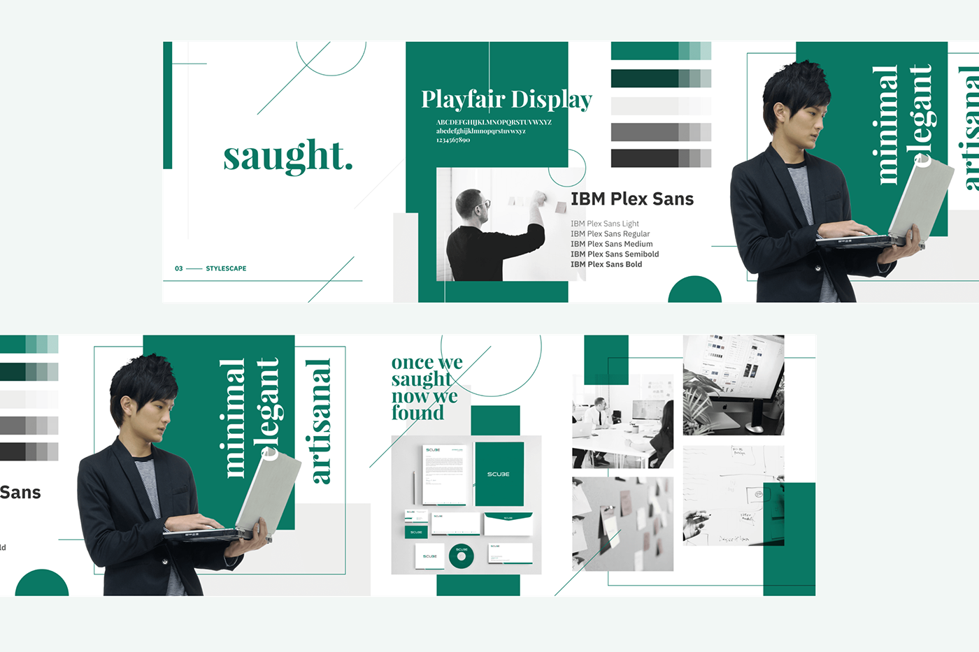
In a noisy agency landscape, the brand needed to stand out not by shouting, but by whispering with confidence. The goal was an identity that felt minimal, elegant, and artisanal—asserting authority through restraint.

The Process
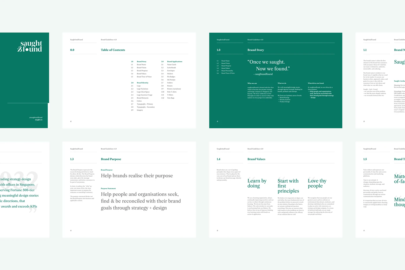
The core purpose is "To seek, find and realise true purpose." This guided our exploration into visual metaphors that could represent both the journey and the destination.
Strategic Excavation
We started with the "Why". Using the 'Golden Circle' methodology, we defined the BHAG (Big Hairy Audacious Goal) to "realise true purpose" for every client. This strategic clarity became the foundation for all visual decisions.
Naming & Etylomogy
We dove into the dictionary and from Middle English saughte, seihte, From Old English saht, seaht, seht (“arrangement, agreement, a peace between two powers, friendship, peace”) From Old Norse sœkja (“to seek; to trace”)
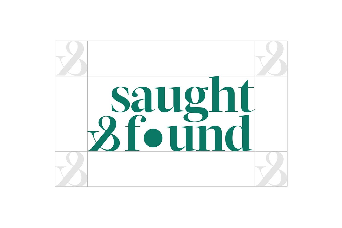
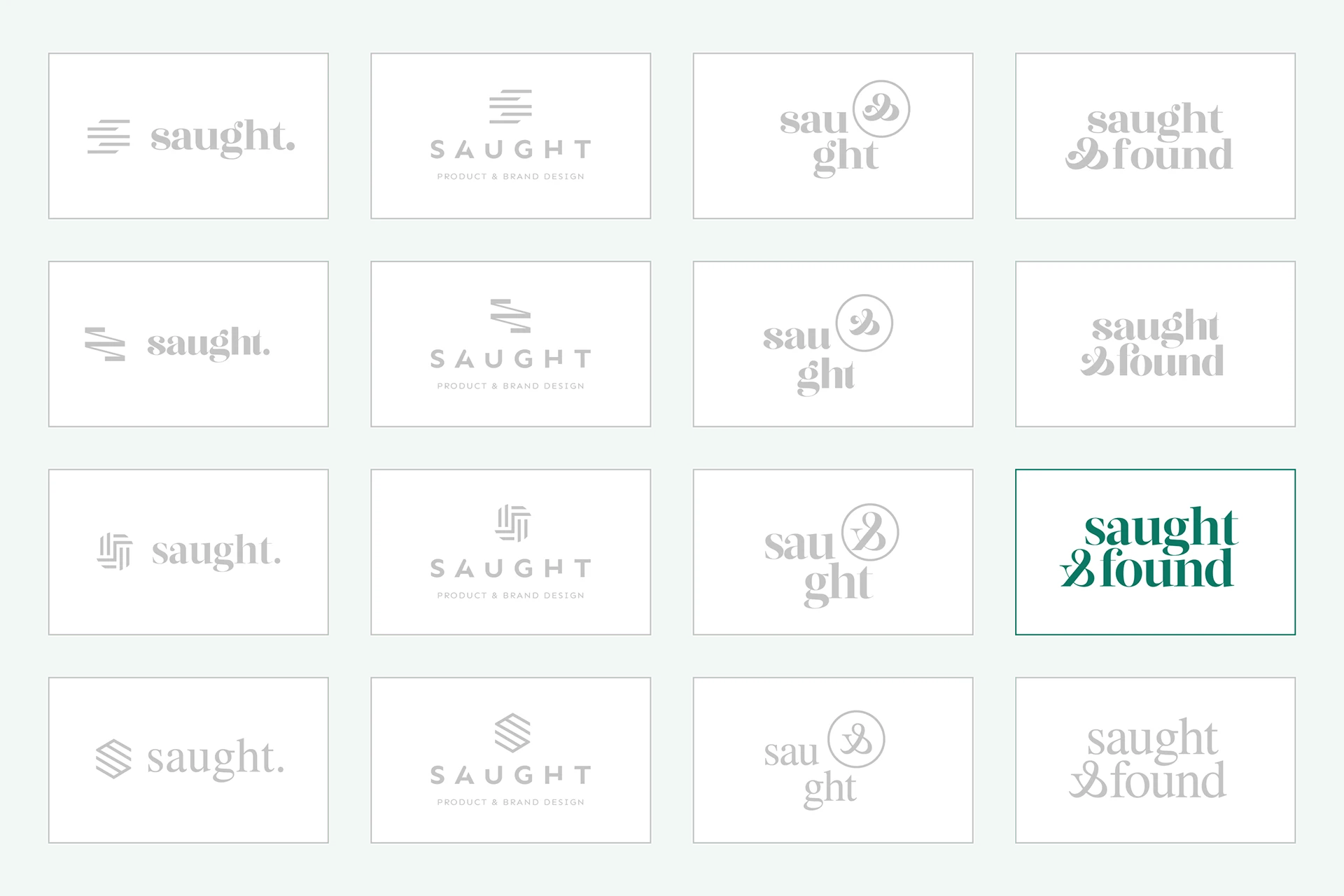
Typographic Harmony
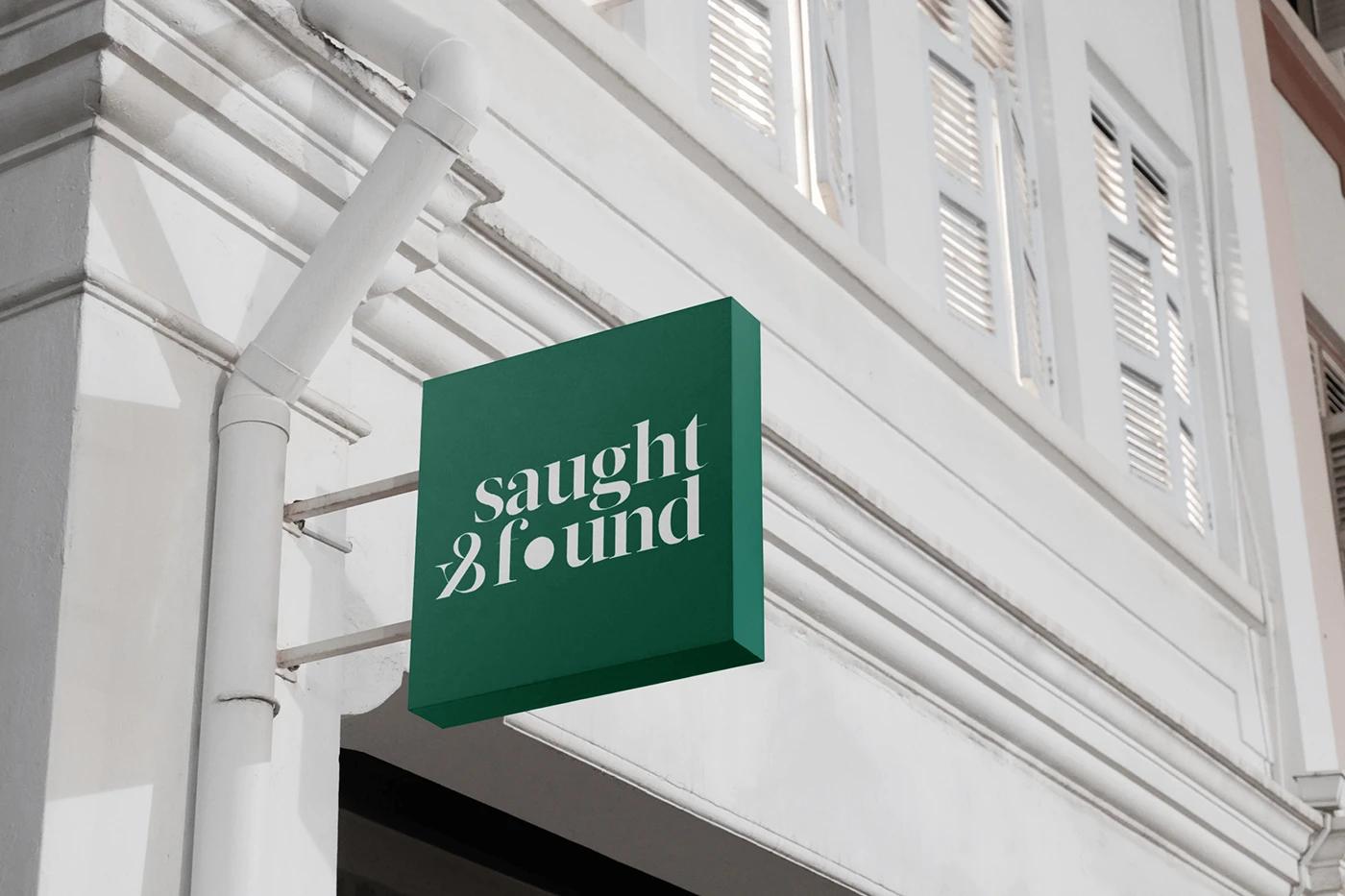
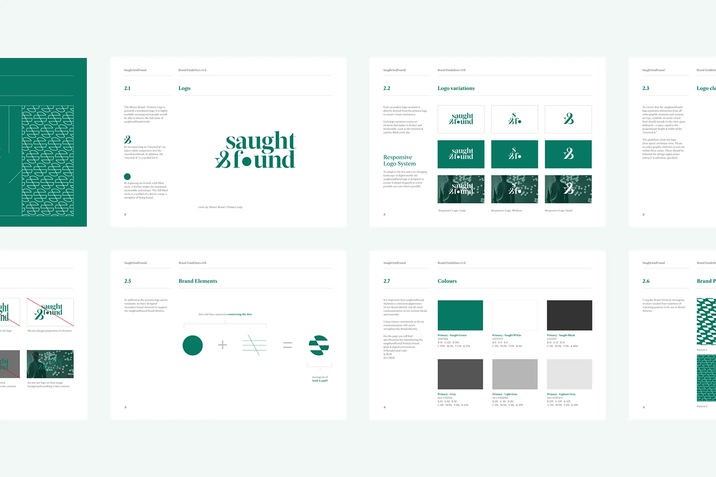
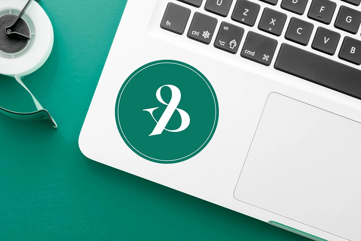
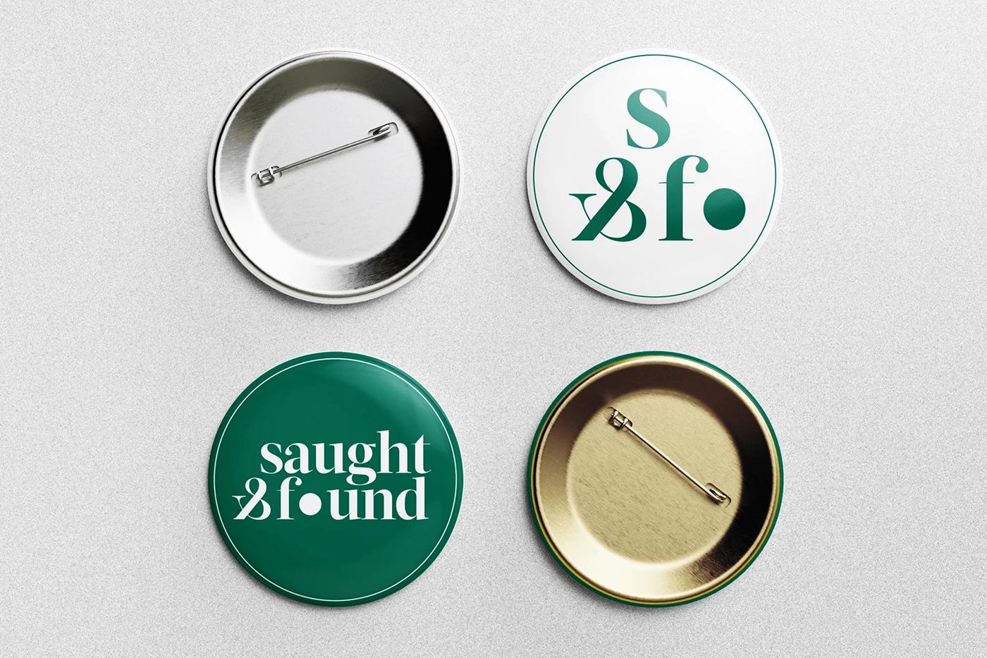
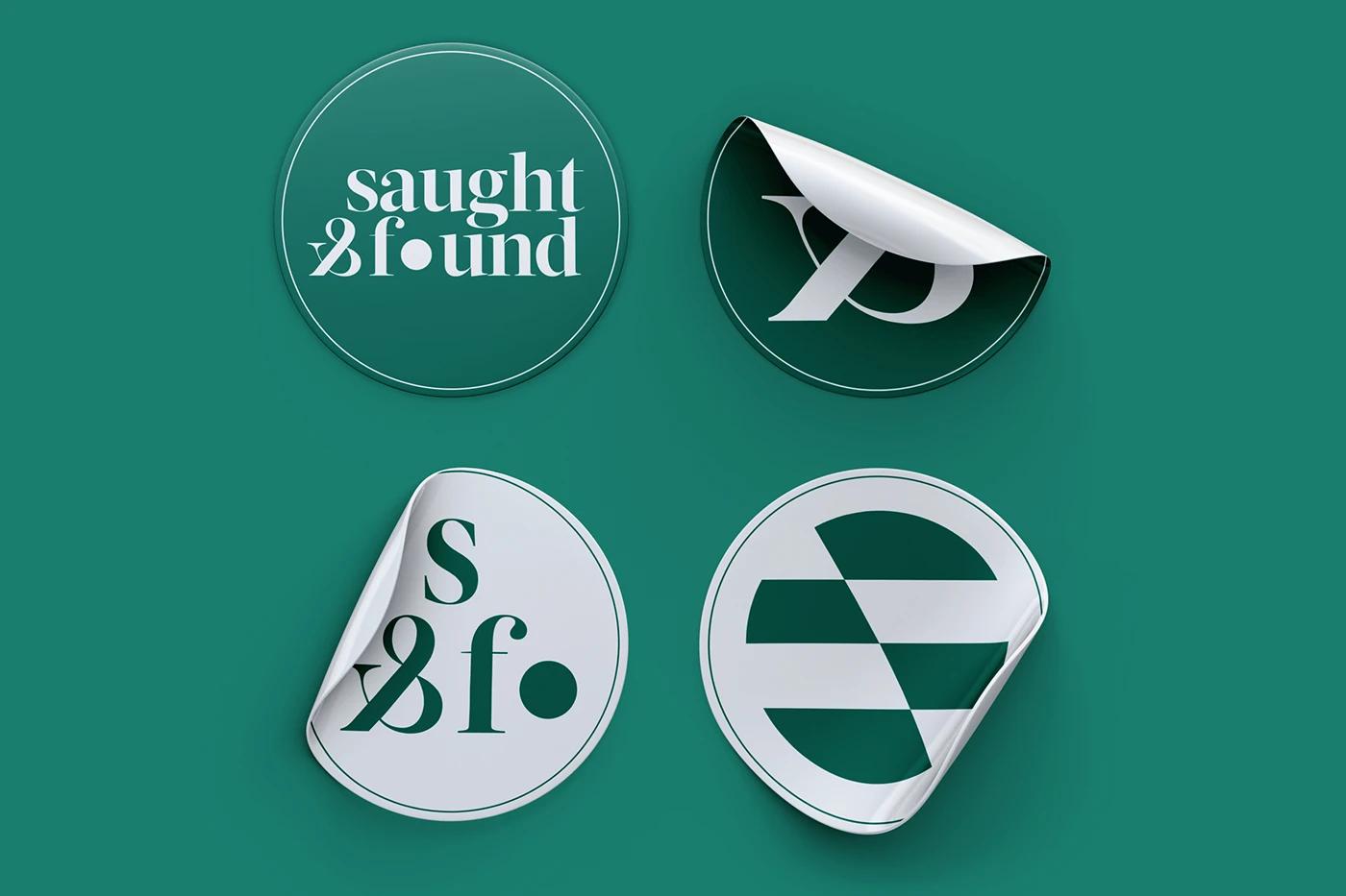
We struck a balance between serif and sans-serif, creating a wordmark that feels both timeless and modern. The inverted ampersand serves as a subtle nod to the "seeking" aspect—looking at things from a different angle to find the hidden truth.
Artisanal Precision
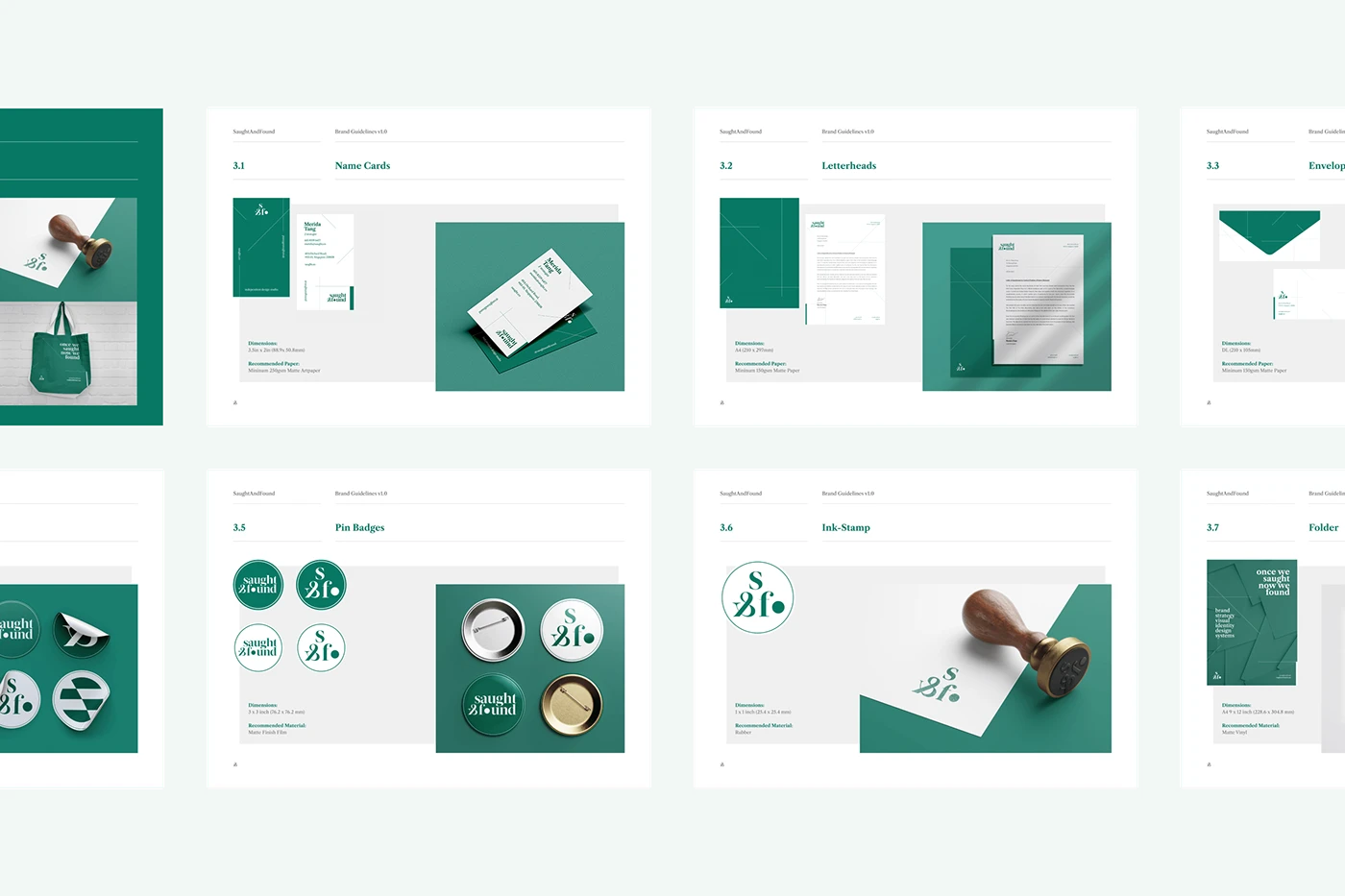
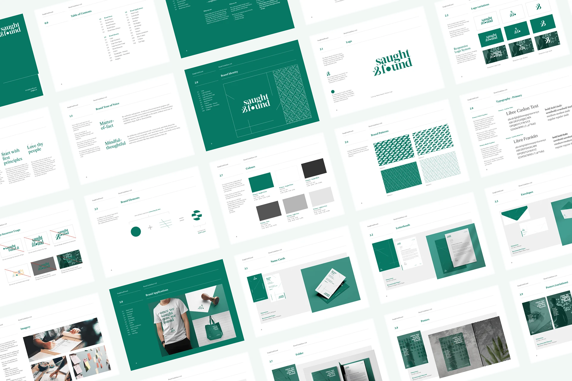
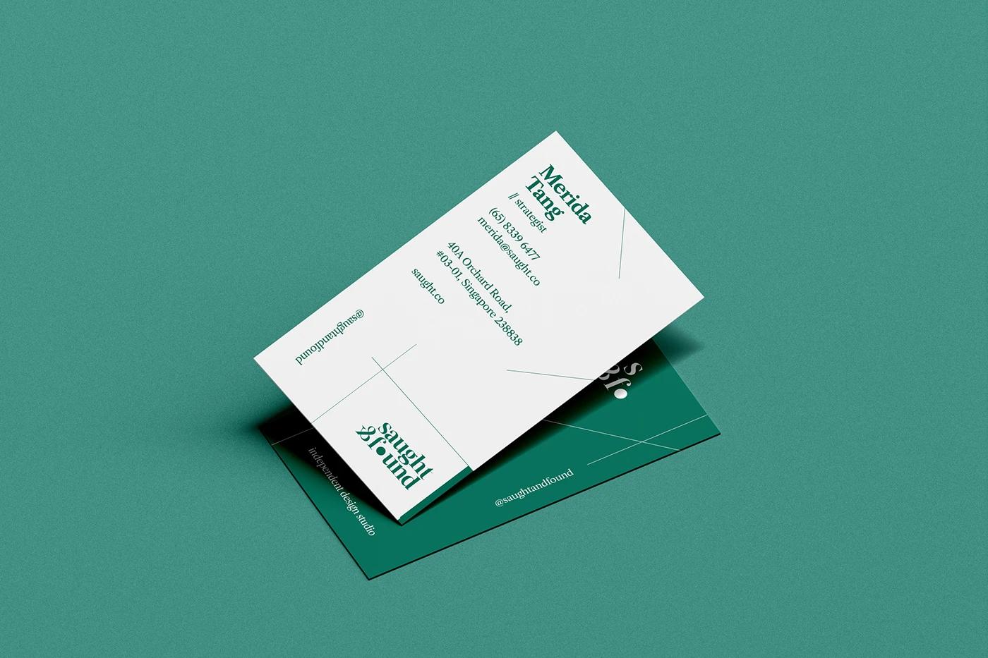
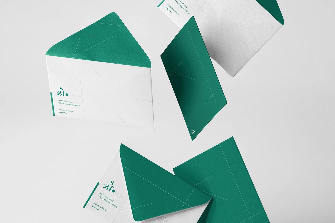
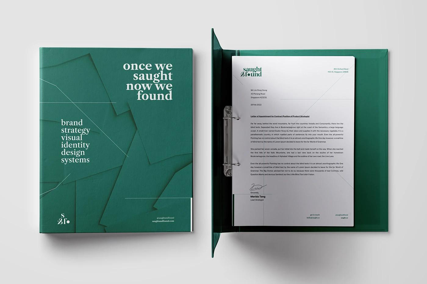
The identity system was built on three pillars: Minimal, Elegant, and Artisanal. This guided every design decision, from paper stock selection to the use of whitespace in digital layouts, ensuring every touchpoint felt crafted, not just produced.
The Solution
The delivered solution is not just a logo, but a responsive & dynamic identity system that connects the dots between "seeking" and "finding".
A Unified Voice
The final brand identity is a quiet powerhouse. It provides a neutral but sophisticated canvas that allows the client's work to shine while still asserting the studio's own distinct character.
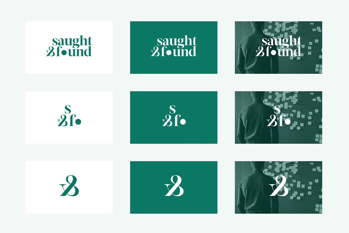
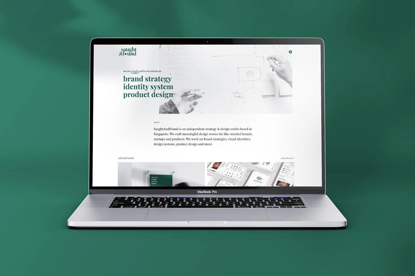
Responsive Systems
The logo system adapts effortlessly from large-scale signage to tiny favicons, maintaining legibility and impact across all touchpoints. It is a living system that grows with the agency.
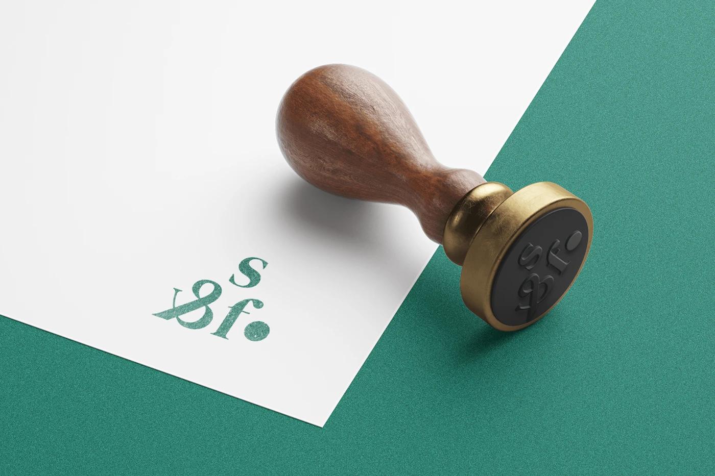
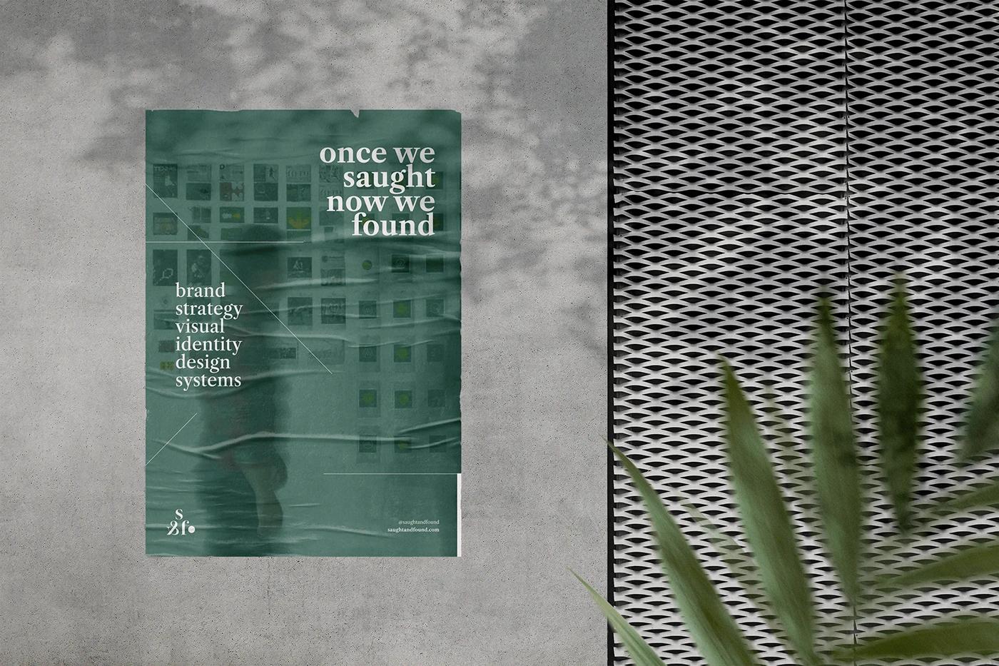
Meaningful Marks
The "filled dot" and "inverted &" became capable brand assets in their own right, used as graphic devices to lead the eye and punctuate key messages, turning punctuation into performance.
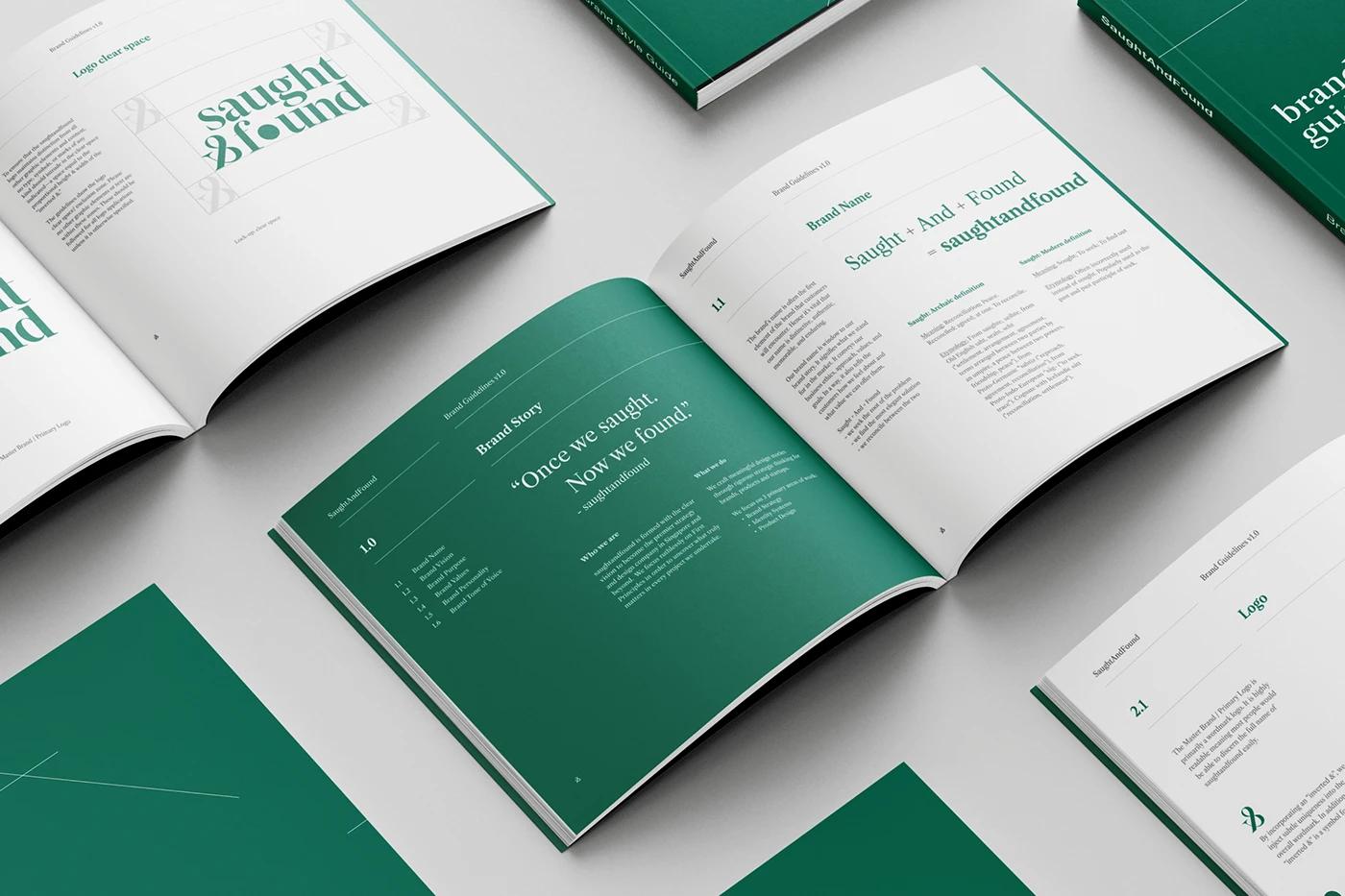
"Saught: To seek, to be at peace. Found: To attain, arrive at. The core purpose is 'To seek, find and realise true purpose.'"
INTERESTED FOR MORE?
ViewMore
Works
Ready to Tell Your Story?
Let's craft a brand identity that bridges heritage and innovation. Your story deserves to be told with intention.